Storefront
Product page block
The Trimsize block, its settings, and what shoppers see.
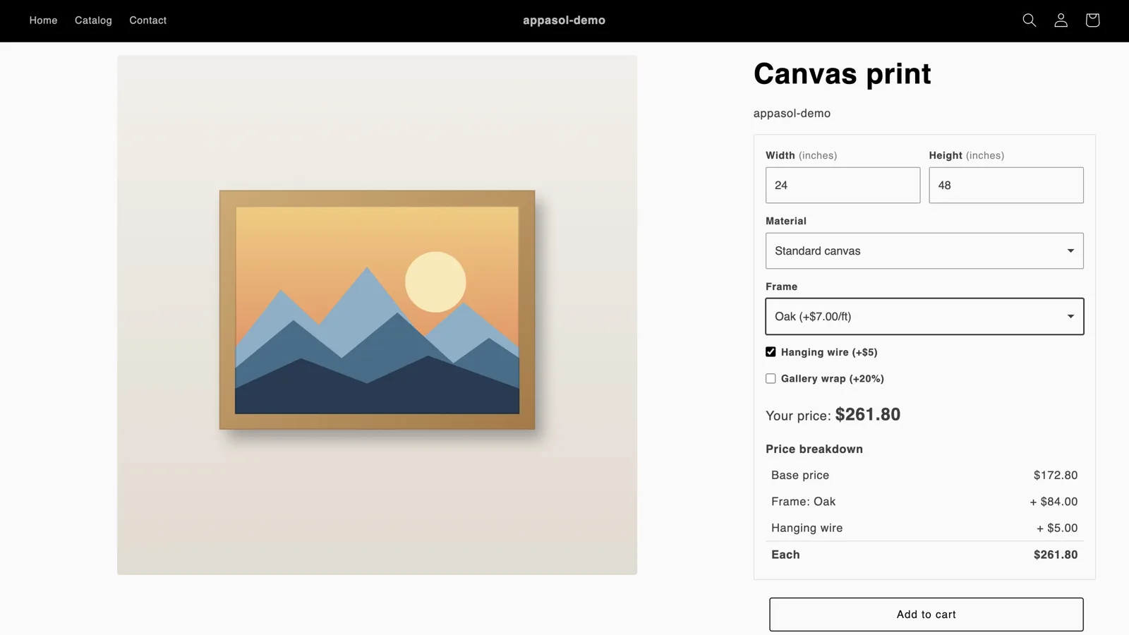
The Trimsize block shows the size fields, material, add-ons and price on products that have Trimsize pricing. On other products it shows nothing, so you can keep it on a template that all your products share.
Add the block
From Home, click Add block in theme editor. Or in the theme editor, open your product template and choose Add block › Apps › Trimsize. Keep the theme's own Price block: on configured products the Trimsize block hides it, and your other products keep their price.
If some products use a different product template, add the block to that template too.
The quantity
The block prices the quantity in your theme's quantity box, as checkout does: quantity breaks, and any formula, rule or validation that uses quantity, show in the price as the shopper changes it. Above 1, the price is for each item, with the total under it: Your price: $64.69 each, then Total for 3: $194.07. On a theme without a quantity box, the block prices one.
Settings
Open Widget customization in the app's menu. Its settings are on four tabs, Content, Style, Colors and Custom CSS, and one Save covers them all. What you set there applies to the block on every product page. On Content:
- Before a size is entered
- Show the lowest price (From $X), the default, or Ask for a size. The lowest price is the smallest allowed size in the cheapest material, with the default add-ons.
- Tax note after the price
- None by default, or + VAT, incl. VAT, + tax or incl. tax, shown after the price in the store's language (in German, for example, zzgl. MwSt.). The note only describes the price: what checkout charges for tax still follows your store's tax settings.
- Show price breakdown
- Off by default. Lists how the price is reached under it: the base price, the minimum charge if it applied, each add-on and each rule.
- Show size preview
- Off by default. A scaled outline of the item with its width and height, drawn as shoppers type.
- Show total area
- Off by default. The area of the size entered, such as Total area: 2.50 m²: in square metres for sizes in millimetres, centimetres or metres, and in square feet for inches and feet. Not shown for products sold by length or for preset sizes.
- Show quantity breaks
- On by default. A "Buy more, save" table with the price per item at each break, on products that have breaks.
- Artwork upload
- Off, Optional or Required. See Artwork uploads.
The look
The Style and Colors tabs set how the block looks. The preview beside the settings uses the storefront's own styles, so it shows the block as shoppers will see it, in the admin's font:
- Card
- The outline around the block (none, thin or thick), its corners, the spacing inside it, and whether it stays up to 480 px wide or fills the product column.
- Fields
- Outlined, underlined or filled; their corners, from square to pill; a thin or thick border; a triangle or chevron dropdown arrow; and bold, regular or small-capital labels.
- Price
- Medium, large or extra large, left or centered.
- Separators and tables
- Lines between the fields and the price, or between every part; and lines, stripes or nothing between the rows of the breakdown and quantity break tables.
- Colors
- Panel, field and price backgrounds, price text, text, accent (the focus ring, checkboxes, the chosen tile, the quantity break reached and the size preview), outline, field border and separator. Each follows your theme, uses one of your store's brand colors from Settings › General › Brand (primary or secondary, or the text color that goes on it), or is a color you pick. Brand colors follow your brand when you change it; where your store has none, the theme's color shows. Use brand colors sets the price bar, price text and accent from your primary brand color and the outline from the secondary. The preview shows brand colors as samples. The block takes its font from your theme.
Reset look, at the top of the page, puts the look back to the defaults, which match your theme. It leaves your custom CSS as it is. Like any change, it applies when you save.
Custom CSS
For anything the settings don't cover, add your own CSS on the Custom CSS tab of Widget customization. It's nested inside the Trimsize block, so its selectors match within the block, and the preview shows it as you type. Write & for the block itself. The block's classes start with ts-:
.ts-labeland.ts-unit: field labels and their units;.ts-input,.ts-selectand.ts-check: the fields, dropdowns and checkboxes;.ts-priceand.ts-total: the price, and the total under it when the quantity is above 1;.ts-breakdownand.ts-breaks: the price breakdown and the quantity break table.
For example, .ts-label { text-transform: none; } or & { border-radius: 0; }. You can save up to 5,000 characters. The CSS can't contain <, and each { needs its }; the page says when something is off, and Save waits until it's fixed (other tabs show Go to Custom CSS). Browsers from before 2023 skip custom CSS and show the block as the settings above make it.
Settings on the block
The block has the same settings in the theme editor. They start on Use the app's setting, with the colors empty, so the block follows Widget customization. Change one there and it takes priority on that template only, for example a different panel color on one product template. To follow the app again, set it back to Use the app's setting, or clear the color.
To keep your theme's colors on one template while the app sets some, set the block's Empty colors to Use the theme's. Colors set on the block still apply. The look (card, fields, price, separators and tables) is set on Widget customization only.
A change on Widget customization that doesn't show on a product page? Check the block's settings in the theme editor: a setting changed there wins.
What shoppers do
- Enter the size
Width and height, in the product's unit, or one length for a product priced by length. The fields show the allowed range.
- Choose a material and add-ons
Add-ons that don't apply to the chosen material are hidden.
- See the price
Your price updates as they type: for one item, or for each with the total under it when they choose more.
- Upload artwork
If you've turned it on.
- Add to cart
The theme's Add to cart button waits until there's a valid price.
Buy it now is hidden on configured products, so every order goes through the cart with its size. Other products keep it.
Let shoppers pick the unit
On the product's Pricing tab, under Unit, tick the other units shoppers can also enter sizes in: inches, feet, centimetres, millimetres or metres. They pick the unit on the product page, and the price, limits and rules stay in the product's own unit. The cart shows the size as the shopper typed it; the production queue shows it beside the size in your unit. If the product uses inch fractions, they apply when a shopper picks inches.
Languages
The block, its messages and the checkout messages are in English and German, following the language the shopper views your store in. Names you enter (materials, add-ons, choices, rule descriptions and your own error messages) show as you typed them, unless you translate them: then shoppers see them in their language on the product page, in the cart and at checkout.